Cool UI
Build beautiful web interfaces by using Cool UI. It is user-friendly, customizable and it has powerful utility classes.
How To Use
Copy and paste the code given below in the <head> tag of your html document, above all other style sheets
How To Customize
Components can be easily customised. In order to override the base classes, users can add their own class to the pre-existing classes, and style them seperately.
Typography
Headings
There are five different headings present.You can use them using these classes - headline-xl,headline-lg,headline-md,headline-sm ,headline-xs
Headline 1
Headline 2
Headline 3
Headline 4
Headline 5
Paragraph Text
There are five different font sizes used for paragraphs.You can use them using these classes - text-xl,text-lg,text-md,text-sm ,text-xs
Paragraph 1
Paragraph 2
Paragraph 3
Paragraph 4
Paragraph 5
Gray Text
You can make your text color gray using text-gray class
Headline 2
Paragraph 2
Text Alignment
You can align text to left,center and right by using classes - text-left, text-center, text-right
Paragraph 2
Paragraph 2
Paragraph 2
Alert
An alert displays a short, important message in a way that attracts the user's attention without interrupting the user's task.
Alerts are available in 4 different types - primary, error/danger, success and warning
To use alerts, add the base class alert and add any one of the following classes for the different types - alert-primary, alert-danger, alert-success, alert-warning
Simple Alert
Alert with Icons
Outlined Alert with Icons
To use outlined alerts, add the base class alert-outlined and add any one of the following classes for the different types - alert-primary-outlined, alert-danger-outlined, alert-success-outlined, alert-warning-outlined
Avatar
An avatar is an image used as a user's profile picture, usually in a circular shape. It is displayed on the user's profile information page.
Avatars are available in 4 different sizes - extra small (xs), small (sm), medium (md), large (lg) . To use the avatar , add any one of the following classes for the different sizes - avatar-lg, avatar-md, avatar-sm, avatar-xs
Image Avatars
Text Avatars
To use text avatars you have to add avatar-text class
Badge
A badge can display the number of notifications or the status of being online or offline.
Status Badges
Status badge is used to represent a user's status. The options are online (green), offline (grey), do not disturb (red), idle (yellow). The badges are available according to 4 avatar sizes - large (lg), medium (md) ,small (sm) and very small (xs).
Text Badges
We can add badges on headings and text
Heading with a badge4
Text with a badge4
Button Badges
Similar to text badges, we can add badges on buttons
Icon Badges
Icon Badges can be used to display the number of messages or notifications or items added in cart or wishlist.
Button
Buttons are the soul of an interactive web application. Buttons allow users to take actions, and make choices, with a single tap. Cool UI provides different types of buttons.
Solid Button
To use the solid button, add the base class btn and any of the following classes for the different types of buttons - btn-primary, btn-danger, btn-success
Large Button
Outlined Button
To use the outlined button, add the base classes btn and btn-outline and any of the following classes for the different types of buttons - btn-primary-outline, btn-danger-outline, btn-success-outline
Link Button
To use the link button, add the base class btn followed by class btn-link
Icon Button
To use the icon button, add the base class btn followed by class btn-icon
Icon Button with label
This is similar to icon button , we just add label here.
Floating Button
To use the floating button, add the base class btn followed by class btn-floating.
Card
Card are used to show user related data collectively, like product details.
You can copy and paste following codes to get different cards
Vertical Card
Redgear Wired Gaming Headphones with RGB LED Effect
Horizontal Card
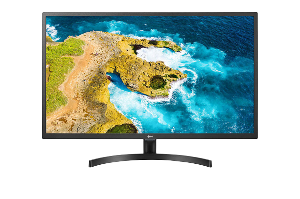
LG 22 inch (55 cm) IPS Monitor
LG 22 inch (55 cm) IPS Monitor
Card with Badge
badges on cards are generally used to display some critical info on top of the card.
Redgear Wired Gaming Headphones with RGB LED Effect
Card with Dismiss
Cards with dismiss button can be closed by clicking on the close button.
Redgear Wired Gaming Headphones with RGB LED Effect
Javascript code
Card with Shadow
To add box shadow , you can use any one of the following class - box-shadow-lg, box-shadow-md, box-shadow-sm
Redgear Wired Gaming Headphones with RGB LED Effect
Card with text overlay
Cards with text overlay are used to indicate some important information to the user using text placed on top of the card.
Redgear Wired Gaming Headphones with RGB LED Effect
Text only card
Card header
Lorem, ipsum dolor sit amet consectetur adipisicing elit. Dolores, corrupti unde. Perspiciatis eos sunt temporibus nulla atque soluta saepe inventore necessitatibus dolorem aperiam alias placeat, eveniet quos sint nisi dignissimos!
Image
Responsive Image Components are used to display Images on websites, which are screen responsive. They expand upto the width of the container they are in.
Responsive Image
In order to make an image responsive simply add the class img-responsive which will make the image occupy 100% width of the parent container. If the screen size reduces, the image size will also reduce without affecting the aspect ratio.

Round Image
To use round images add classses img-responsive and rounded-full


Input
Inputs are necessary for user interaction with the website. Inputs are used to take information from the user
Label Inputs
Modal
Modals are like pop-ups which are positioned over everything else in the document. Only way to close it is to click the close button or click on action button.
Simple Modal
Modal header
Cras mattis consectetur purus sit amet fermentum. Cras justo odio, dapibus ac facilisis in, egestas eget quam. Morbi leo risus, porta ac consectetur ac, vestibulum at eros.
Modal header
Cras mattis consectetur purus sit amet fermentum. Cras justo odio, dapibus ac facilisis in, egestas eget quam. Morbi leo risus, porta ac consectetur ac, vestibulum at eros.
Javascript code
List Modal
List modals can be useful if you have to select any particular item from list
Modal header
Modal header
Javascript code
List
List groups are a flexible component for displaying a series of content like notifications drawer.
Spaced List
-
John Doe
@johndoe
Lorem, ipsum dolor sit amet consectetur adipisicing elit. Suscipit dolore earum ducimus quaerat perferendis natus itaque beatae quae et assumenda id quo eius facere, illum excepturi sapiente ipsam. Iste, quos.
-
John Doe
@johndoe
Lorem, ipsum dolor sit amet consectetur adipisicing elit. Suscipit dolore earum ducimus quaerat perferendis natus itaque beatae quae et assumenda id quo eius facere, illum excepturi sapiente ipsam. Iste, quos.
-
John Doe
@johndoe
Lorem, ipsum dolor sit amet consectetur adipisicing elit. Suscipit dolore earum ducimus quaerat perferendis natus itaque beatae quae et assumenda id quo eius facere, illum excepturi sapiente ipsam. Iste, quos.
Stacked List
-
John Doe
@johndoe
Lorem, ipsum dolor sit amet consectetur adipisicing elit. Suscipit dolore earum ducimus quaerat perferendis natus itaque beatae quae et assumenda id quo eius facere, illum excepturi sapiente ipsam. Iste, quos.
-
John Doe
@johndoe
Lorem, ipsum dolor sit amet consectetur adipisicing elit. Suscipit dolore earum ducimus quaerat perferendis natus itaque beatae quae et assumenda id quo eius facere, illum excepturi sapiente ipsam. Iste, quos.
-
John Doe
@johndoe
Lorem, ipsum dolor sit amet consectetur adipisicing elit. Suscipit dolore earum ducimus quaerat perferendis natus itaque beatae quae et assumenda id quo eius facere, illum excepturi sapiente ipsam. Iste, quos.
Grid
Grids are used to display content in columns on a website. They make the site look cleaner and more consistent.
Cool UI provides 4 types of grid layouts and they are responsive.
20-80 Grid layout
If you want to use any container as grid with 20%-80% layout then first add grid class to it followed by class grid-20-80 .
30-70 Grid layout
If you want to use any container as grid with 30%-70% layout then first add grid class to it followed by class grid-30-70.
50-50 ( 2 Column ) Grid layout
If you want to use any container as grid with 2 column layout then first add grid class to it followed by class grid-50-50.
3 column Grid layout
If you want to use any container as grid with 3 column layout then first add grid class to it followed by class grid-3-column.
Rating
Toast
Toasts are basically notification messages that appear on the screen to inform the user about something. They disappear after a few seconds and also they can be closed using close button.
Javascript code
Slider
Sliders are used to define a particular range whose exact value is not important. Sliders can be used to control the sound in video player or filer the price in e-com website.
Simple Slider
sliders value can be set using min and max attribute of input element.Also we can read current value of slider using javascript
You selected 200
Javascript code
Styled Slider
We can style slider using css.
Slider with Icon
disabled Slider